
About the Project
Jewish Reconstructionist Congregation (JRC) is a 500-family congregation just north of Chicago that houses an accredited preschool, weekly religious school classes, and more than 90 annual community events including, religious services, concerts, continuing education classes, meetings, and social action projects.
I joined the staff in 2016. One of my goals was to help unify the brand so that the website, email marketing, and promotional materials would work together to better serve the congregation and promote its events.
Defining Challenges
Little room for change
Little about the organization’s website had changed since 2011
Frustratingly, very little on the Drupal site was customizable, and any CSS changes would incur steep “redesign” fees
inconsistent brand identity
As often happens in community-led organizations, most of the imaging was put together by lay leaders and whoever had the time to pitch in.
The result was a very confused brand. Some issues included:
Low resolution images
Mismatched colors without any brand identity or unity
Lack of branding/logos or use of low-rez logos instead of EPS files
A very handmade, thrown-together style with an unintended “wacky” sensibility
Outdated Internet style that made this progressive congregation seem old-fashioned
Nothing captivating or innovative to grab people’s attention


Gathering Stakeholder Input

Balancing the Needs of Many
Leadership and Staff Goals
As the strategic plan continued to be updated, priorities and procedures changed, and technology was one way to streamline these procedures.
The ultimate goal of the leadership was to increase membership, and they wanted our branding to be exciting enough to set us apart and encourage people to visit in person.
The school directors specifically requested a different look for their promotions. They didn’t find the existing branding youthful or fun enough, and they wanted to get away from the stuffy reputation that religious school programming may have.
Member’s Needs
No thought was given to the dramatically different goals of member and non-members users.
Organization was not intuitive, and members often complained about having to dig for information.
Temporary Website Improvements

Making Info Stand Out
Before:
All paragraphs started with bolded plain text instead of H1 or H2 headers. This hurt our SEO and made it difficult to scan. I went through and redefined paragraphs breaks adding H2 headers.
Long blocks of paragraph text hid instructions and usable information. I rewrote many pages to remove “feel good” language, and split paragraphs into bullet lists.
The website didn’t have CSS for buttons—there were only inline text links.

After:
On some pages I created used anchor links to create an alphabetized “directory” so people could jump to the info they were looking for more quickly.
New headings allow people to jump to what they are looking for.
Because there was no CSS for buttons, I created PNGs and hyperlinked them.
The big bold buttons serve as a call to action, and are easier to click on mobile.

Getting Rid of Intro Pages and Multiple Levels
Before:
Already buried in secondary navigation were entire micro-sites where subject had its own page.
Every section had a landing page with unnecessary introductory text.
Entire pages devoted to one small topic could be combined.
Example: Selecting “Ritual” took visitors to a cover page with redundant information and no links.
Buried within that menu was a section with multiple pages and nested menu options.

After:
Eliminated redundant intro pages
Condensed information to fit on one page
Used anchor link menus to help people sift through a dense information


Thinking of the paths of different users
Before:
Resources for members were often intertwined with marketing information.
The site prioritized welcoming new visitors and introducing the community, rather than giving members access to tasks.
Members would become frustrated with the website, and instead would call staff with routine questions.
Example: The tiny link to the member directory was buried in a copy block.

After:
I created quick-links on the home page to frequently searched items like the school schedule and payment forms.
I wrote with different voice and tone for different purposes.
Example: The membership renewal page has clear links to instructions and important information with details below.
Using the words I used language members were actually searching, like “resources for committee chairs,” “How to get stuff done” and “who should I call?”

Towards a New Website

Needing a Change
There were still some problems that couldn’t be solved by simply reorganizing or adding pictures.
An old fashioned, multi-block layout
Not mobile responsive
No control over CSS
To clean up content and nested pages it would be easier organize from scratch
Redesign Option: CRM Integrated Website
The Benefits
Connected with our database and financial system so members could have a curated experience with saved contact info, profiles, and banking information that could auto-populate forms
Very affordable customizable templates
Code injection options and the ability to change CSS settings
Designs that were modern and attractive to better represent the congregation without spending time or money to develop a unique visual design
Preparing For an Eventual Move
I brainstormed some solutions that went beyond temporary fixes.
I drew wireframes possible navigation menus, home pages, and footers.
Good, old-fashioned post-its helped me move things around and rethink which pages could be grouped together.
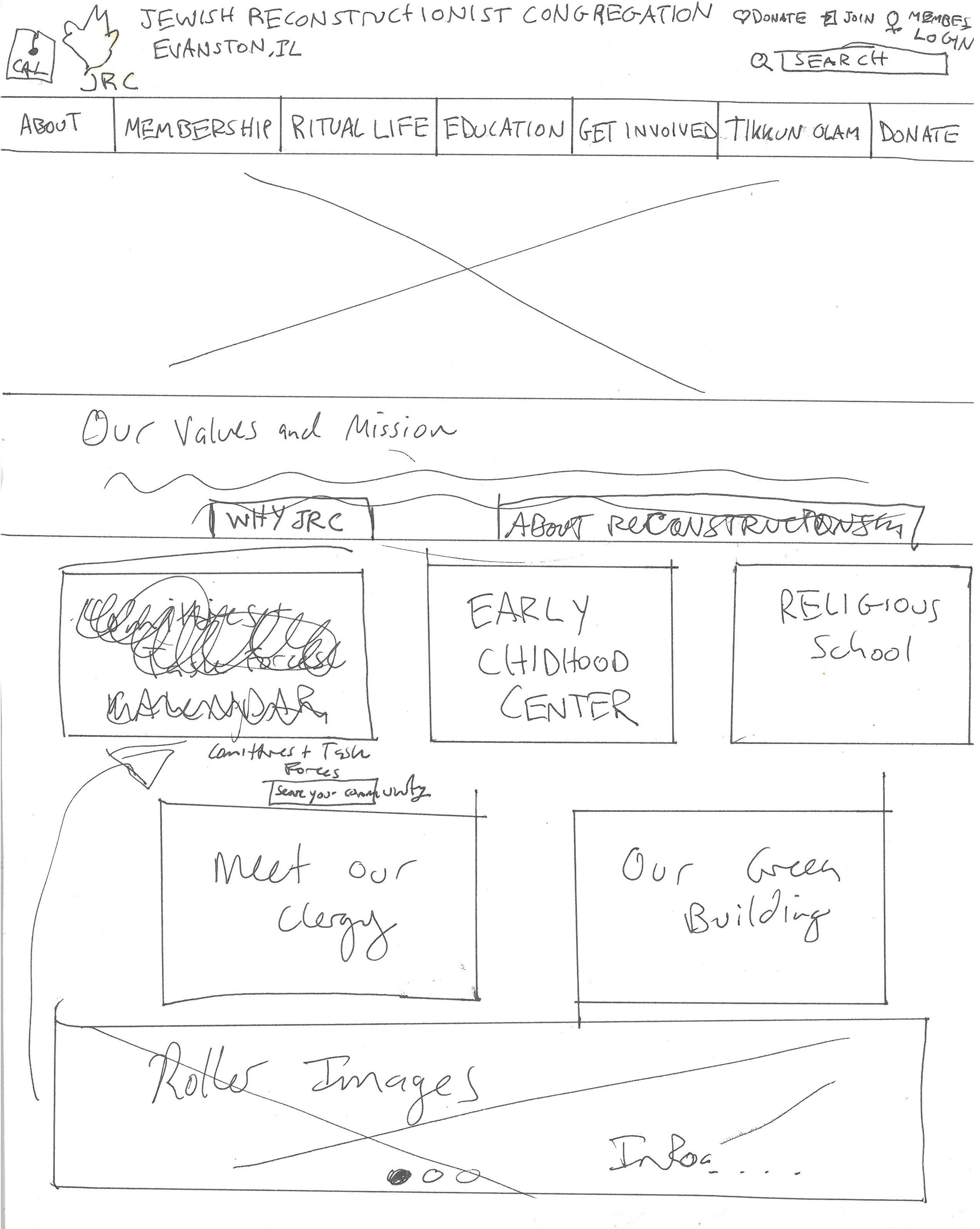


New Template Options
The CRM system offered many website templates, some more modern than others.
I printed each wireframe to look at the types of blocks that were offered and how they might meet our needs.
The template below was my favorite option because:
It has a nice top navigation with drop-down menus (eliminating landing pages)
There is an optional secondary navigation with attractive buttons
The “dual” intro sections could help split the path of members and non-members above the fold

A Branded MOCK-UP
I mocked-up a version of this template with JRC’s photos and brand colors in Adobe XD.
This design was presented to stakeholders for input and consideration for a customizable, flexible website.
