
About the Project
Rebirth Garments is a fashion brand that focuses on the needs of people on the full spectrum of gender, size and ability. I worked with designer Sky Cubacub to recreate the brand’s website and strategize how to use technology to advertise and spread the brand’s mission.
Defining Business Goals and Challenges
The company not only makes and sells clothes, but also creates art performances, publishes a zine, mentors youth, and engages in activism and advocacy. So I had to find a way to balance all of these objectives and maintain clarity.
The target audience of queer, gender-nonconforming, transgender, and disabled people is fairly niche and contains subculture jargon that other people might not understand.

Making running a small BUSINESS easier
I spoke with the designer to find out what parts of running the business were most difficult, and how a web redesign might alleviate them.
The designer was very tech-phobic, so the website needed to have a clear-cut design that was easy to edit, with mostly evergreen content that didn’t need to be changed.
Because all of the clothing is custom made from scratch, it is actually complex to explain to consumers “how it works” to make an order. Making the process clearer would reduce the number of questions the designer faced each day.
Website Redesign

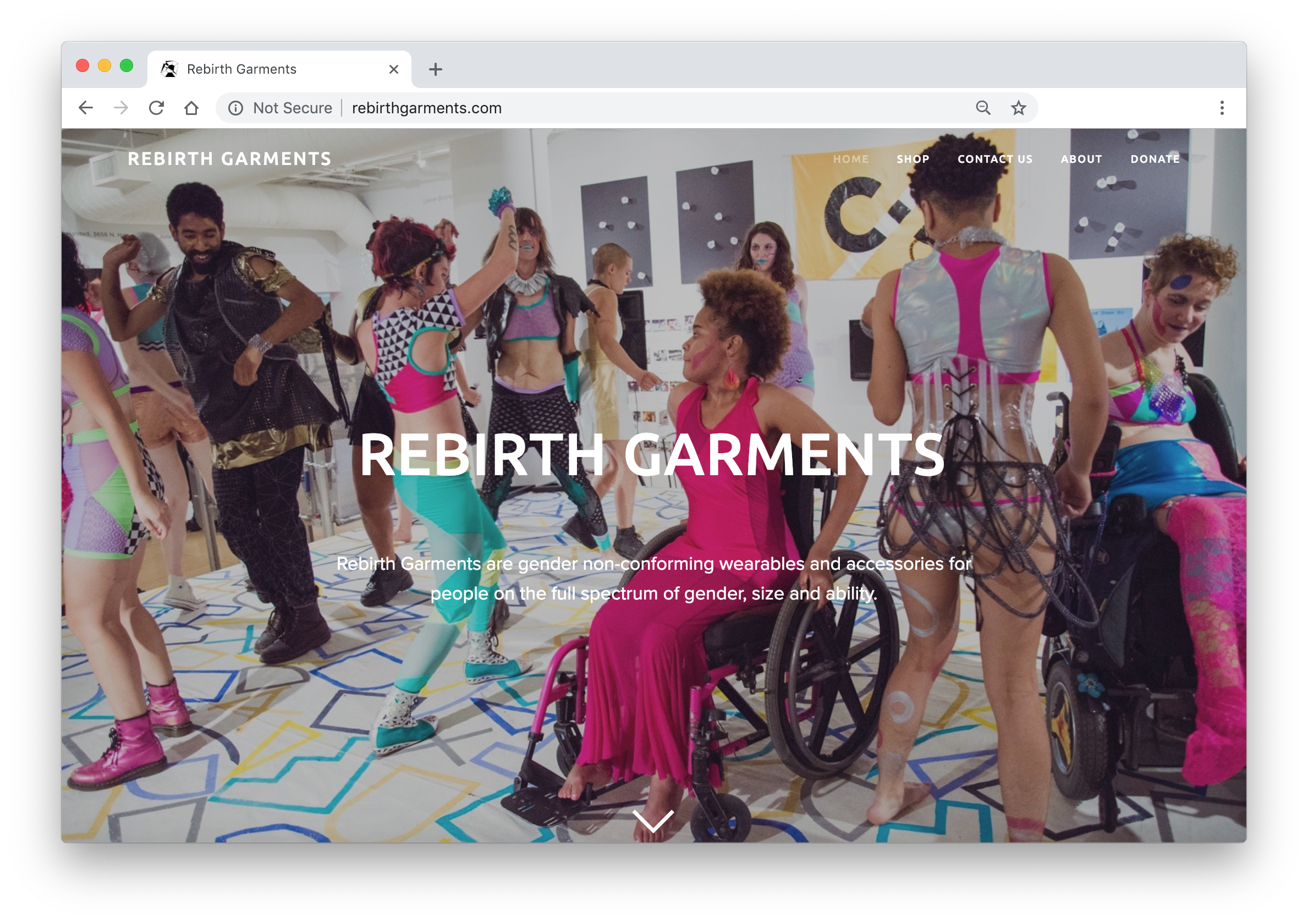
Home Page
Before:
The original homepage on the “Radical Visibility” free Wordpress website was simply a landing page for a manifesto.
The actual purpose of the company (to sell clothing) was lost.
Visitors were immediately bombarded with a giant wall of text.
The background of every page was a bright neon pink with reverse white text. It was difficult to read, jarring, and not very accessible - ironic for a company specializing in needs of people with disabilities.


After:
The new design, created with Squarespace, is clean, clear, and airy with white backgrounds, and trendy with parallax scrolling.
There is a clear mission statement and the website serves the dual purpose of shopping for clothing and making a social impact through art and performance.
Shop Page
Before:
No images of products or examples of how to make custom orders were available, and there were very vague instructions about how to make a purchase.
There were no calls to action with clear ways to follow through.

After:
The designer already had a following on Etsy, was comfortable using their interface and shipping options, and so wasn’t interested in having an e-commerce platform built into the website.
To mimic a “shop” and show some pricing and styles, I took screenshots of the items listed on Etsy and hyperlinked the pictures to send shoppers to each item there.
We drove traffic to the actual store where they could make a purchase, but also showed them options right on our website.

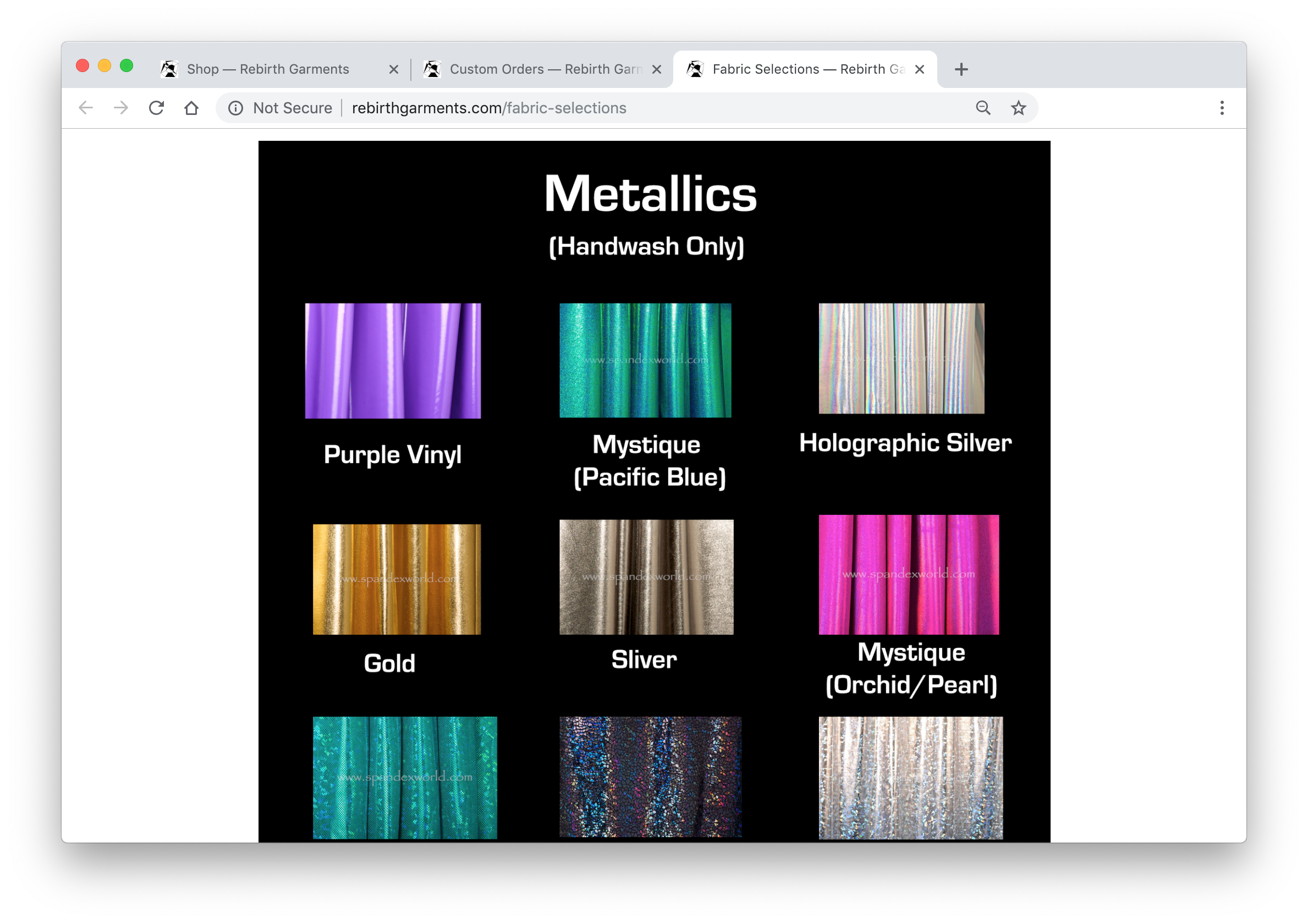
Explaining how Ordering Works
The Shop page also served as a place to explain the sizing and fabric options, all of which are customizable.
Fabric selections were taken from the supply website so shoppers could browse the colors available.
A Custom Requests button linked to a form to collect clothing requests and measurement information. The designer could then follow up with customers and send them a quote for their custom item.

Room for Extras
A secondary footer navigation allowed space for more content that supported the brand’s mission without getting in the way of the business.
The footer includes:
Links to read the full manifesto
Picture and video galleries from past performances
Ways to promote the brand’s notoriety with pages showing press and past events

Getting Outside Impressions
Friends and family who viewed the site had a lot of questions about the fundamental mission and intentions of the brand, since the political aims were mostly unfamiliar.

Creating A Glossary
This led me to create a glossary for the website, recognizing that the terms might be unfamiliar for a wider audience.
It was a way to talk to people who may have stumbled across our website or possibly as a resource for customers to share with people in their lives to help explain their divergent political or gender identities.

Tone and Content
Often, people who are transgender, have mental illness or disabilities feel burdened having to constantly explain to others what their lives are like and how they present themselves to the world. With this design project, I felt I could have an opportunity to present these ideas in a plainly worded and friendly way that’s removed from some of the pain people in these communities grapple with.